Brand Guidelines
Updated April, 2026.
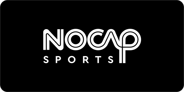
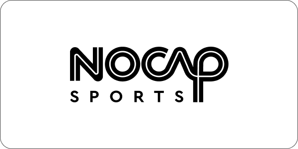
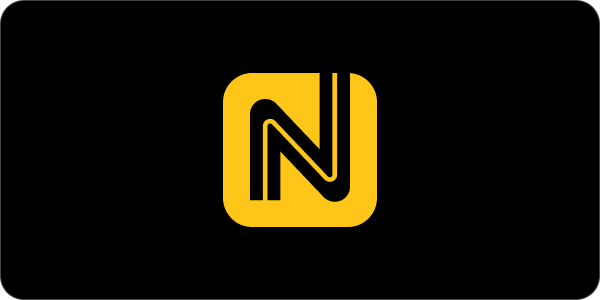
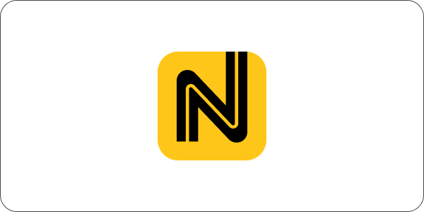
Logo
Our logo combines an approachable design language with clean typography to capitalize on our existing recognition. Our primary wordmark should be utilized in 90% of applications.
Wordmark
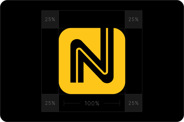
Logo Mark
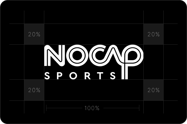
Safe Space
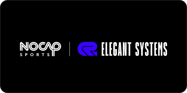
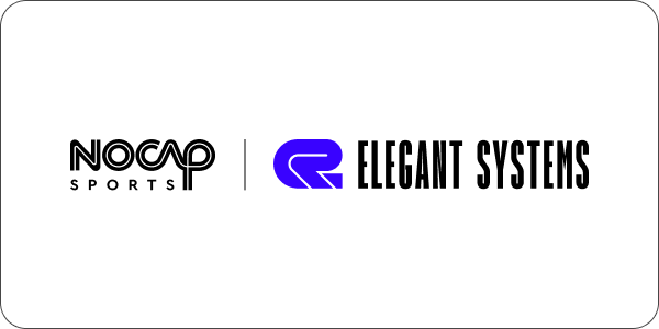
Partnership Lockup
Color
Our color palette features a striking, unique primary color, complemented by a carefully chosen set of secondary colors that add richness and variety to our designs.
Primary Colors
HEX: #FFC61A
RGB: 255, 198, 26
CMYK: 0, 22, 90, 0
PMS: 1235 C
HEX: #000000
RGB: 0, 0, 0
CMYK: 0, 0, 0, 100
PMS: Black 6 C
HEX: #FFFFFF
RGB: 255, 198, 26
CMYK: 0, 0, 0, 0
PMS: Bright White
Secondary Colors
HEX: #FFC61A
RGB: 255, 198, 26
CMYK: 0, 22, 90, 0
PMS: 1235 C
HEX: #FFC61A
RGB: 255, 198, 26
CMYK: 0, 22, 90, 0
PMS: 1235 C
HEX: #FFC61A
RGB: 255, 198, 26
CMYK: 0, 22, 90, 0
PMS: 1235 C
HEX: #FFC61A
RGB: 255, 198, 26
CMYK: 0, 22, 90, 0
PMS: 1235 C
HEX: #FFC61A
RGB: 255, 198, 26
CMYK: 0, 22, 90, 0
PMS: 1235 C
Typography
Our brand font is Inter.
Inter is an exceptionally functional font, thanks to its sleek, modern design, which ensures outstanding readability while projecting a professional and friendly image.
Note: When an alternative font is required, such as in PowerPoint, please use Roboto.
AaBbCcDdEeFfGgHhIiJjKkLlMmNnOoPpQqRrSsTtUuVvWwXxYyZz0123456789([{}])|*!?:;,.-–—©&%$¢#@®™°€£¥−×=↑→↓←"'«»“”
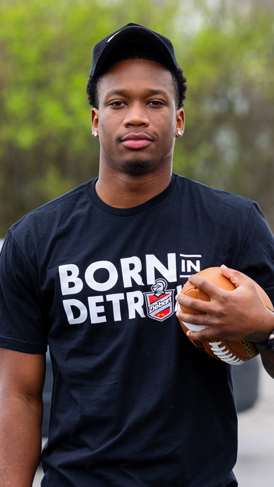
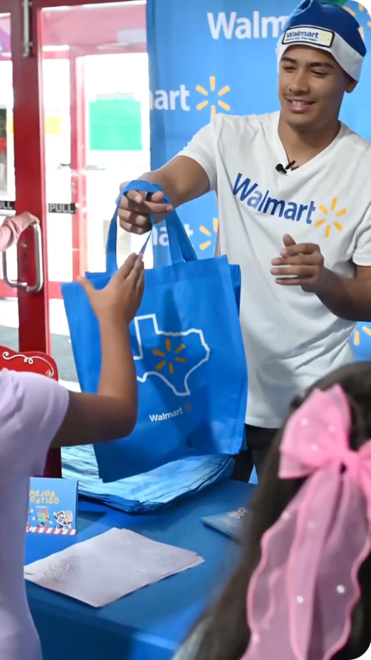
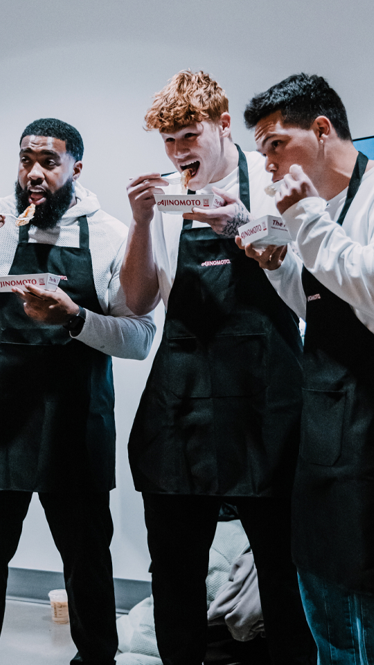
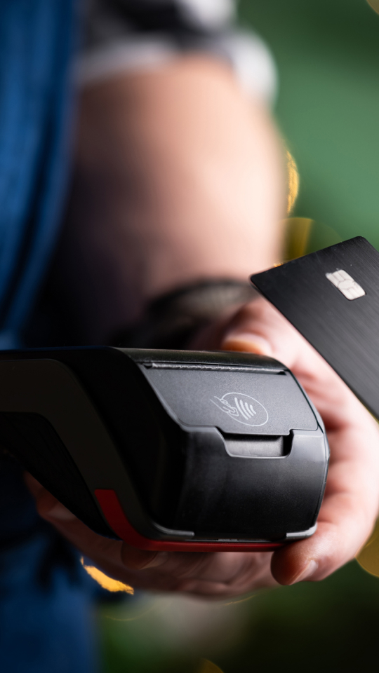
Photography
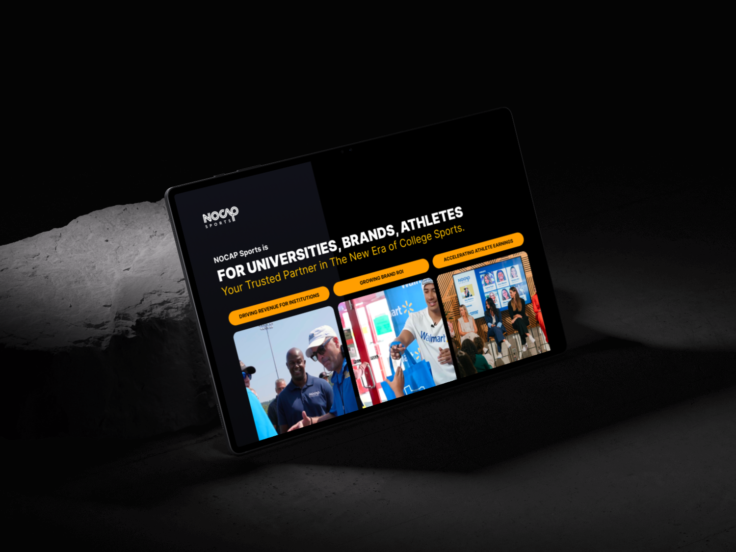
Our brand photography captures the energy and diversity of American sports culture, reflecting authentic real-world moments and perspectives that bring our brand to life.


Graphics
The “Triangle” and “N” shapes can be used for any orientation and for masking images and videos.


Iconography
We chose Phosphor Icons as our brand’s icon repository because it provides a versatile, consistent, and highly customizable open-source system, enabling seamless design-to-development integration and ensuring a cohesive visual identity across all products.
Usage:
Bold outline and glyphs
Consistent line weights
Icon sizes and padding
Use primary brand colors (black, white, yellow)
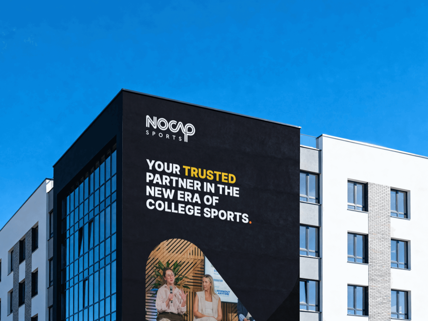
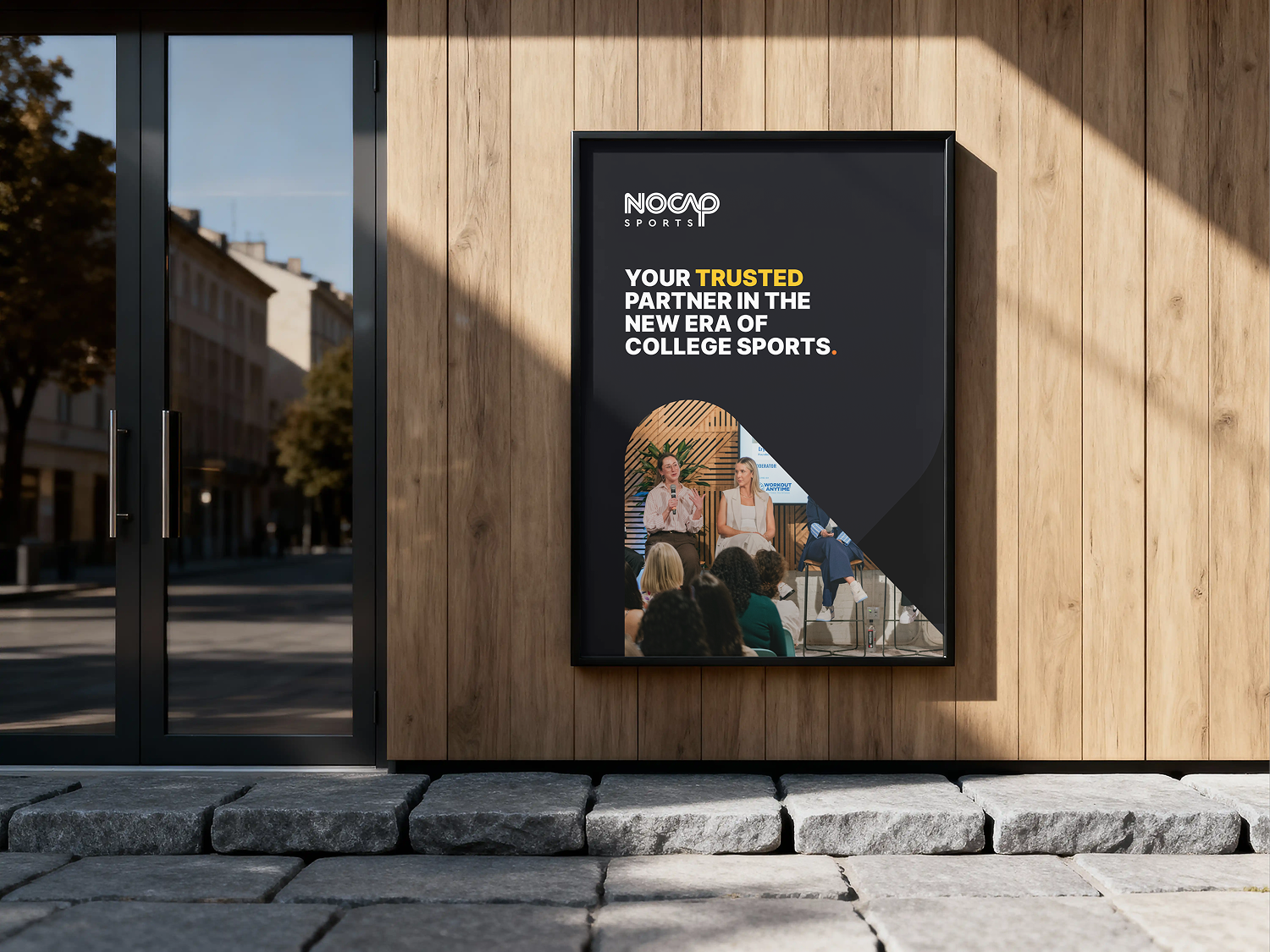
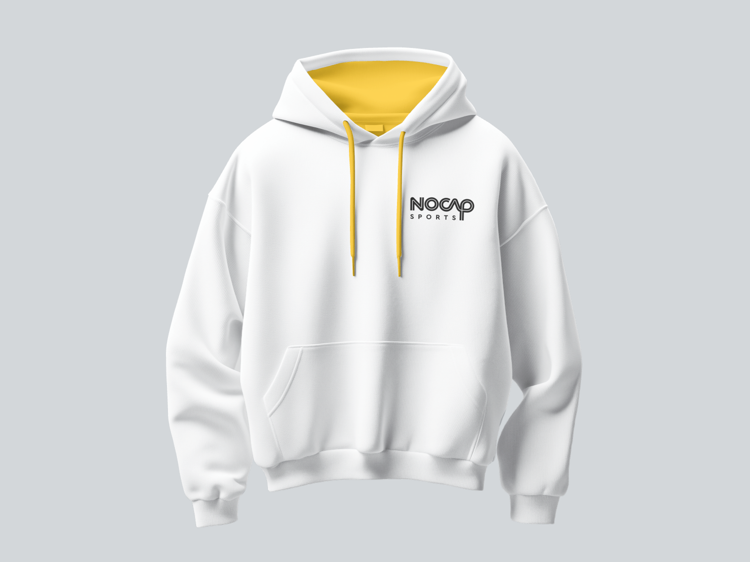
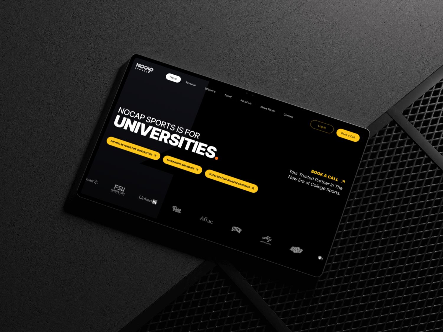
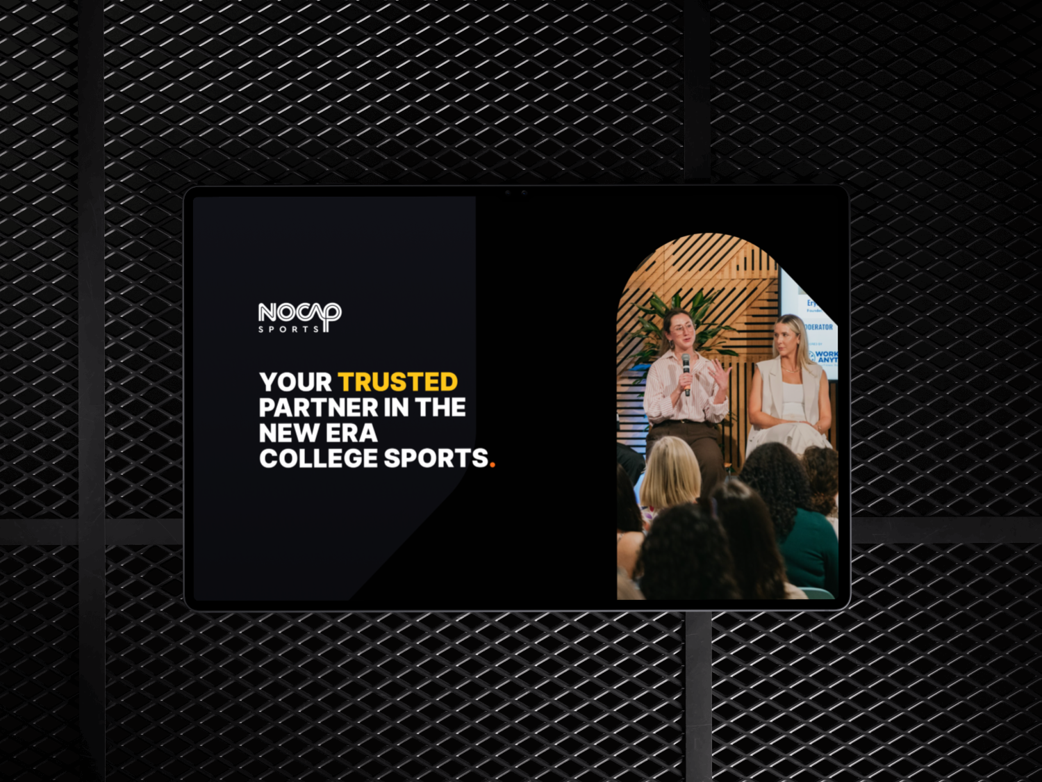
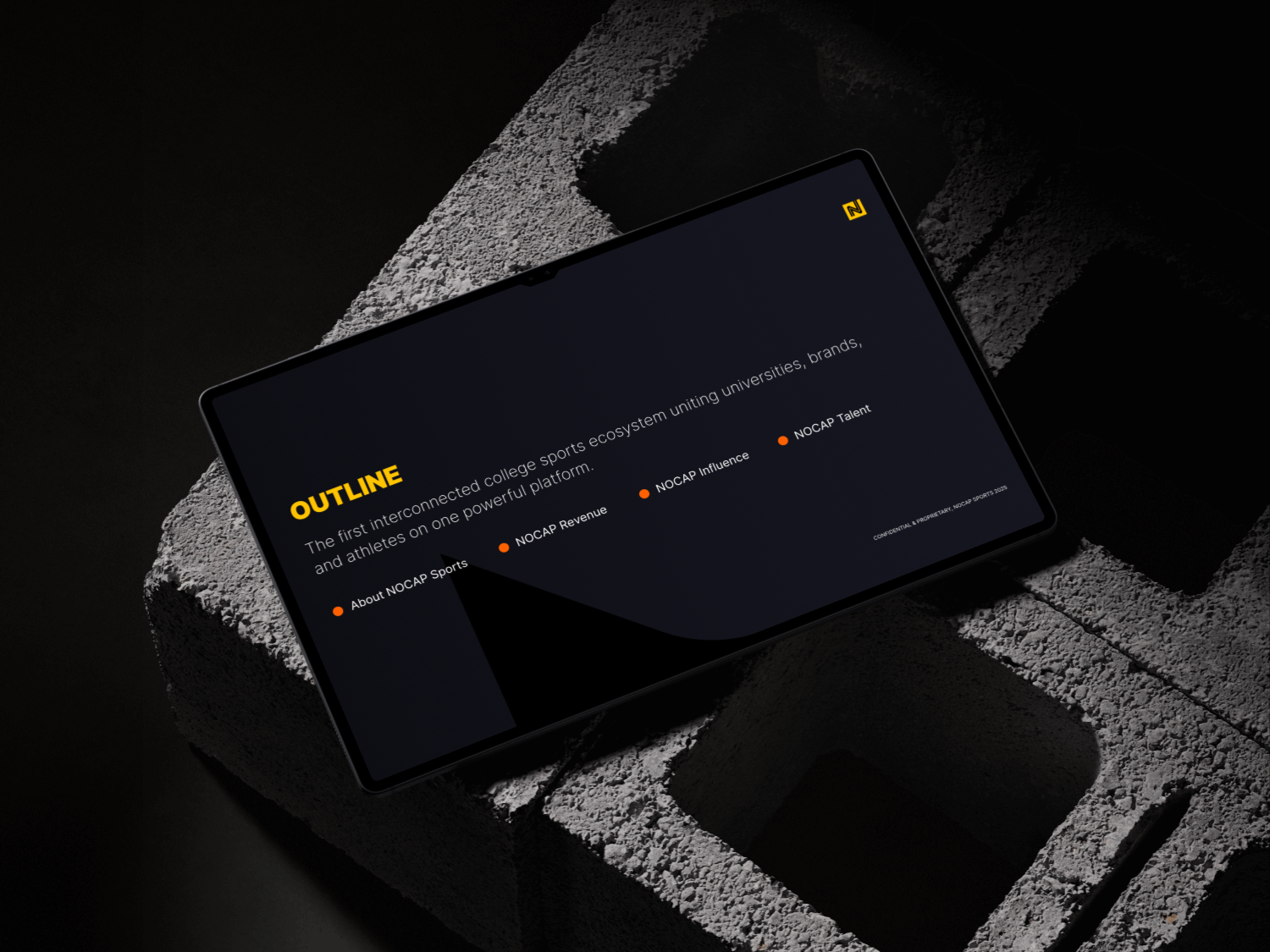
Applications
The key brand elements in our metaphorical toolbox enable us to craft a flexible, yet unified, brand narrative. The examples below illustrate how this story can be brought to life through both product and marketing applications.